Fewer parts, much more work
Only if you're as picky as me though ^^;
[Backpack]
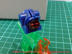
Dark gray for the exterior of the thrusters, red for the interior. The later goes first, and any spill over can be covered all the color on the outside.
[Backpack Components]
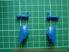
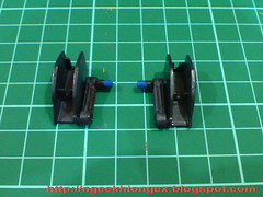
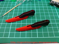
Total makeover for the anti ship sword and beam launcher's mount racks on the backpack, from total blue to total dark gray (from Gundam Marker SEED set).
The top portion of the wings are painted in black, and the painting turns out to be a bit uneven. Each one of them are quite a big area to paint and curvy edges are not too friendly to your marker. ^^; Unlike most other parts which would look better with more layers of painting applied, the wing is exactly the other way round. The more you do it, the clearer the mistake is going to be. I'll just leave it the way it is right now.
Part of the interior, which form the top portion painted in black as above should be in the same color as well. I skipped that though, as it's a little to hard to paint ^^;
[Beam Shield]
Here is the most interesting part to paint. How does one turn a part from clear pink to clear blue? ^^;
Like the color I used on the mono-eye camera of Zeon MGs in the past, blue permanent marker comes to my mind immediately when I was thinking about the beam shield. Sure it can retain the transparent quality of the shield, but the shield is a significantly larger part to paint as compared to mono-eye camera, you really don't need to try on any part to see those ugly trails and layers to be appearing. ^^; An 'X' to the idea. ^^;
Gundam Marker then?
Definitely better than normal marker for such a large area, but the transparent quality of the beam shield would be compromised. Even those glittering particles inside the shield would be gone.
Well, if you can't get all your cool ideas fulfilled, realizing half of them aren't too bad right?
Gundam Marker go!

The color used is Metallic Blue from BB Senshi Sangokuden set.
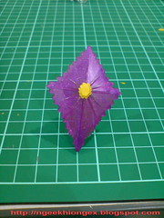
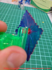
Painted the back of the shield only, as well as those "staircase" on the side on the shield later on.
As a result, the shield is not in clear blue/blue, but purple instead. But from certain perspective, you can see the effect of Metallic blue from the layer of paint on the back. The transparent quality is gone D: but the glittering particles inside the part are even more visible now, since the blue painted sort of provided a backdrop for all of them. Shiny too ^^
Give and take eh? ^^
[Beam Rifle]
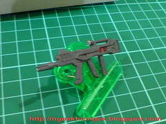
All white to all gray, leaving the targeting scope. Plus two tiny spots in red on either sides of the rifle's body.
[Anti-ship Sword]
Light blue from SEED Destiny Set Vol. 1. Actually, this color should go in first, followed by black for the handle, and white for the edge of the sword. However, prior to completing the whole component, I was a bit reluctant to paint the body in light blue, for a lot of the paint is required. "Leaving it in blue is OK I think." And I painted the black and white part.
After a while, I just submit to my own pressure of following the official color. ^^;
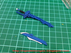
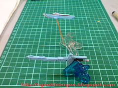
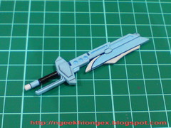

For the two edges of the sword, silver is not a bad color. but I don't suppose I want that color for my MG Destiny, so I go for white for to be consistent with the same part from the MG version.
[Beam Launcher]

Just red for the "cap".
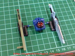

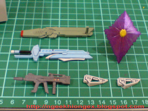
All the completed weapons.
Done with the painting? Nope. Still a bit of touch up needed. Stayed tuned for Part 4. ^^


2 comments:
Excellent job. I'm too lazy to paint weapon connector and the big sword from blue into light blue.. Just paint the white part.
>>Epsilon_013
Thanks ^^
Not painting those parts is beneficial as well - less paint get scratched off. But I couldn't help to paint all of them most of the time ^^;
Post a Comment