After the introduction, this posting will focus on the many option parts included in this Figma set and more images of Dorothy to examine the figure's details. ^^
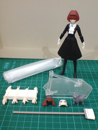
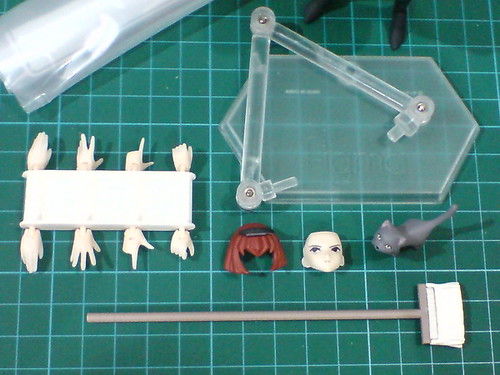
Accessories and option parts included for Figma R. Dorothy Wayneright.
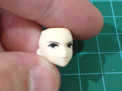
The only option face part for Dorothy which shows Dorothy looking to her right.
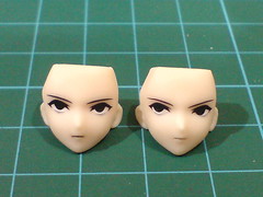
Comparison with the default face part on the figure.
The two parts look completely the same if you don't examine the details close enough. ^^;
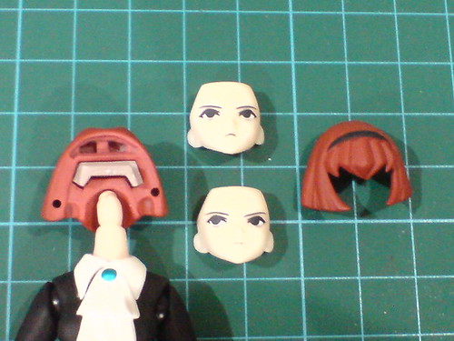
Typical Figma design to swap between the face parts.
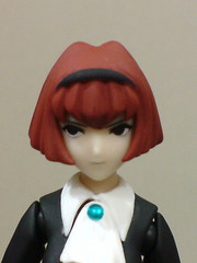
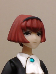
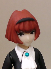
Dorothy with the option face part.
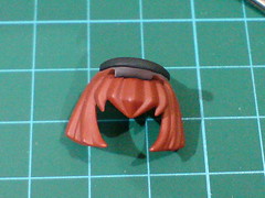
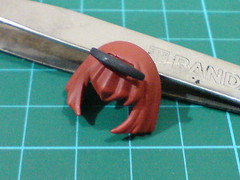
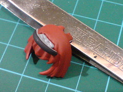
The option fringe part with Dorothy's memory drive expanded.
It's a useful part to realize Dorothy's "assistance" to Roger during the blackout scene at the beginning of Episode 3: "Electric City". ^^
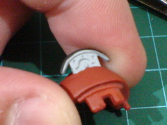
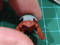
Closeups on the memory drive's details.

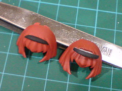
Comparison with the default fringe part.
While the fringes' design is the same, the option part seems to lack the matte finishing that eliminates its glossiness.
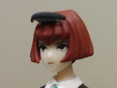
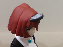
Dorothy with the option fringe part.
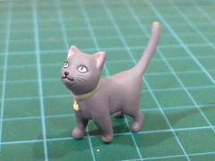
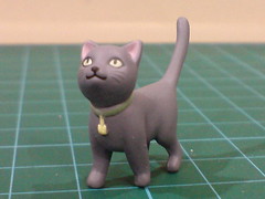
Pero, the kitten adopted by Dorothy in Episode 8: "Missing Cat".
The interaction between Dorothy and Pero in that episode showed her growing capacity for human emotion. Still, it was one the saddest episodes in the entire series in my opinion. ^^;
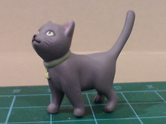
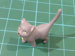
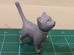
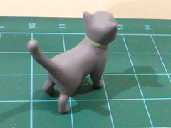

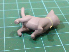
Closeups on the mini figurine's details.
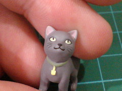
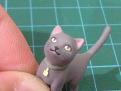
Pero has a very sharp and clean detail treatment for its face. ^^
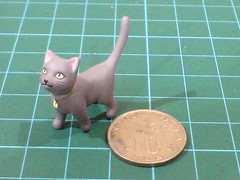
Pero is exceptionally well done considering its small size, as seen here when compared to a 10-cent coin. ^^

The mop that Dorothy used every so often at Roger's mansion. ^^
A water bucket is missing though. ^^;
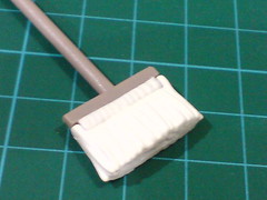
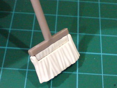
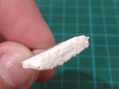
Details of the yarn bundle.
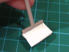
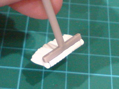
A simple hinge joint allows the yarn bundle to be bent.
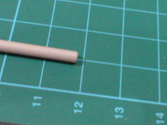
The broom is about 12cm in length.
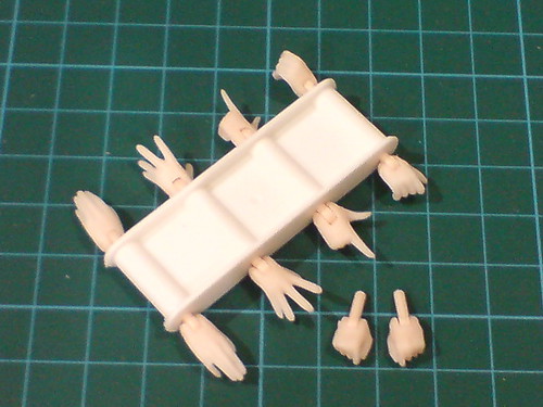
As with most other Figma figures, four pairs of option hand units are included for Dorothy.
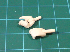
(Left) A pair of open fists to hold the mop.
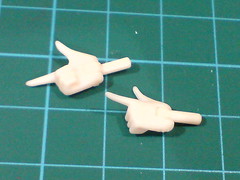
(Right) The "L" sign pair.

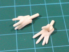
(Left) A pair of standard-looking spread palms.
(Right) A pair of more expressive ones.
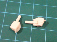
The default pair of closed fists.
Due to the tiny size of the wrist perhaps, all of Dorothy's hand units have straight pegs as connectors to the wrists instead of using the more standard ball-type joints as seen on most other Figma figures.
More images of Figma Dorothy:
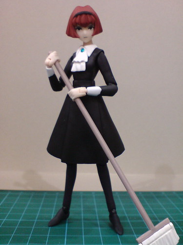
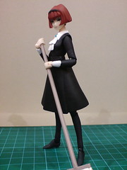
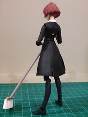
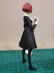
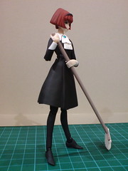
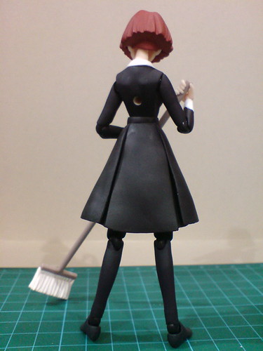
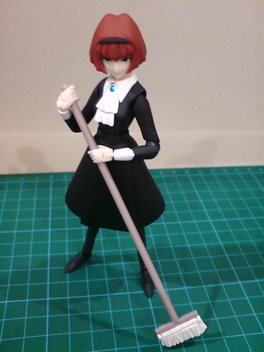
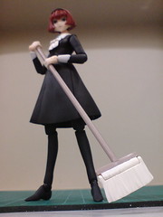
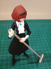
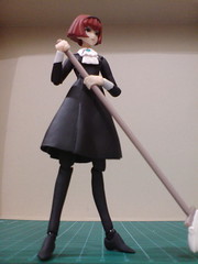
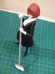
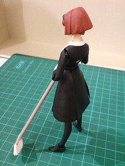
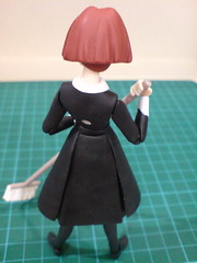
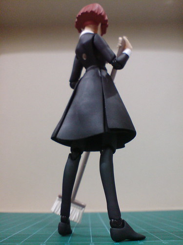
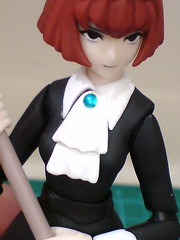
Closeups on the details:
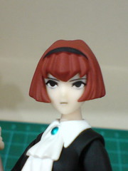
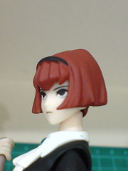
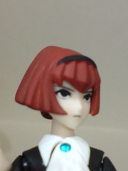
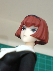
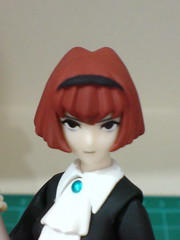
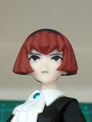
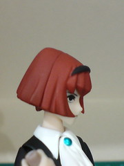
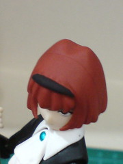

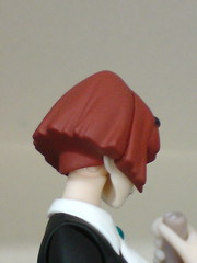
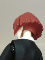
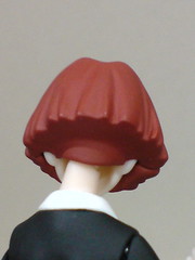
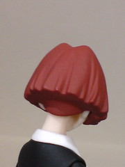
[Head]
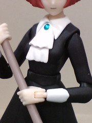
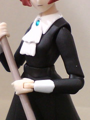
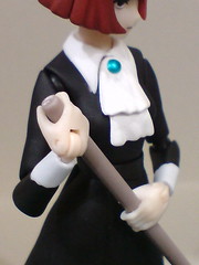
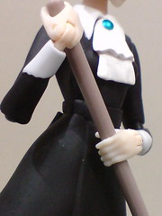
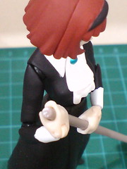
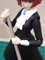
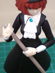
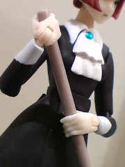
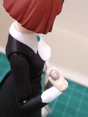
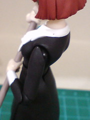
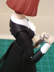
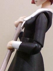

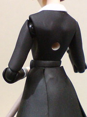
[Body and arms]
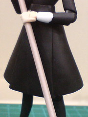
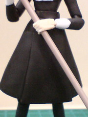
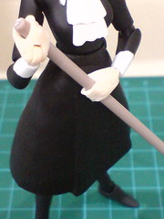
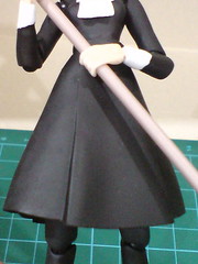
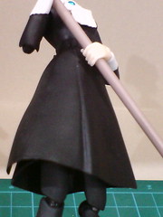
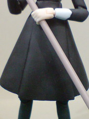
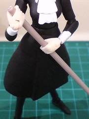
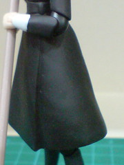
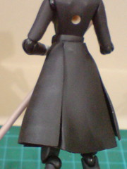
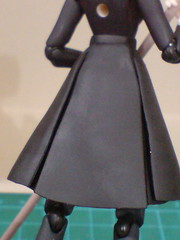
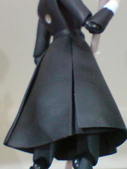

[Dress]
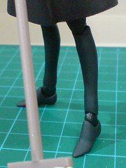
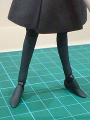
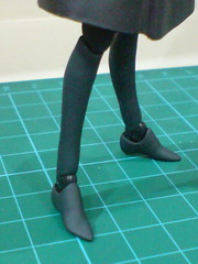
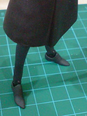
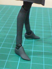
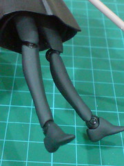
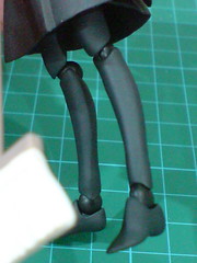
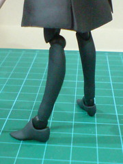
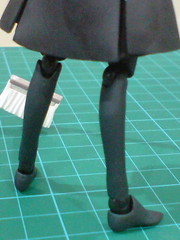
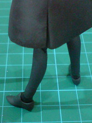
[Legs]
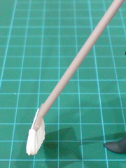
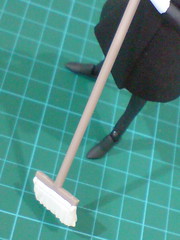
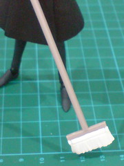
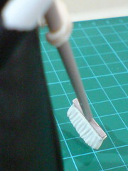
[Broom]
A very plain-looking figure this is. ^^ About 80 percent of the dress is in black, of the same color tone some more. At the same time, the rest of the figure that isn't in black, including her head, the collar and chest frill have very simple detail treatment as well. Then again, there's no reason to complain about the lack of details at all I think, since this is how Dorothy looked like in the anime. The lack of details is very show-accurate in that sense. ^^
 One particular change made to the character design for this figure that I do like is her bigger eyes, which help to reduce the visibility of the pair of gray bottom eyeliners on her face. Together with her lack of facial emotion, I remember those gray bottom eyeliners gave Dorothy a constant tired look whenever there was a closeup shot of her face (see left image which shows Dorothy from the anime). ^^; I'm glad this particular detail wasn't been included as "accurately" as the rest (or lack thereof). ^^
Another change that I welcome very much is the design of more visible bust for Dorothy on this Figma figure, but I don't think I want to go into details on that matter. ^o^
A look at the figure's articulation design and some action poses coming up next. ^^


No comments:
Post a Comment