After the previous posting on her elder sister, the focus now shifts to Play Arts Kai Serah Farron with an introduction on the option parts included for her and more images of the figure. ^^
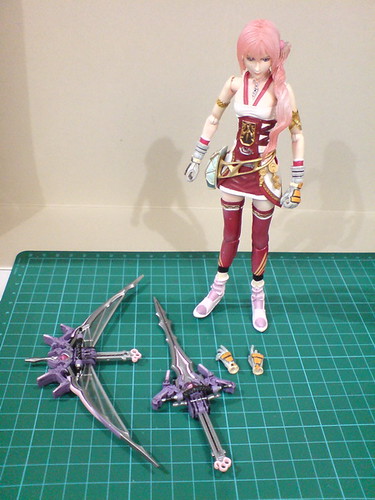

Weapons and option parts included for Serah.
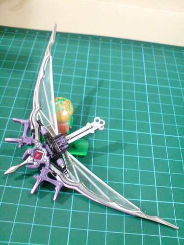
The bow-sword in bow mode.
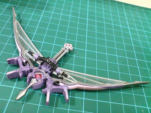
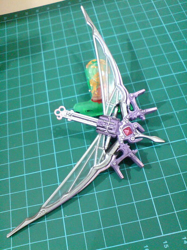
Volume-wise, it's a pretty massive weapon component. ^^
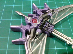
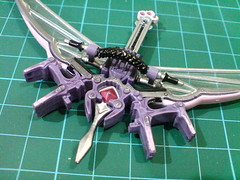
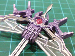
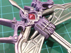
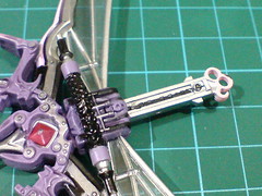
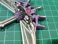
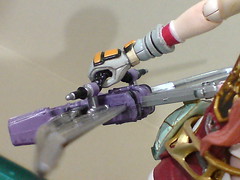
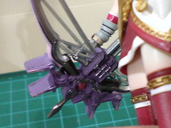
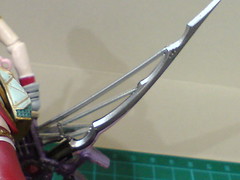
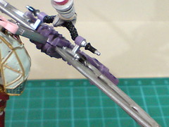
Closeups on the details of the bow-sword.
Unlike the same kind of weapon in reality, the grip is a dedicated component designed to be protruded above one side of the handle area.
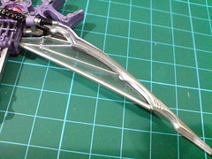

Instead of actual bowstrings, they are silver details painted over clear parts that connect the upper and lower limbs to the grip.
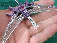
While I prefer actual bowstrings to "replicated" ones executed on this weapon component, the high level of transparency helps to hide the solid clear parts pretty well.
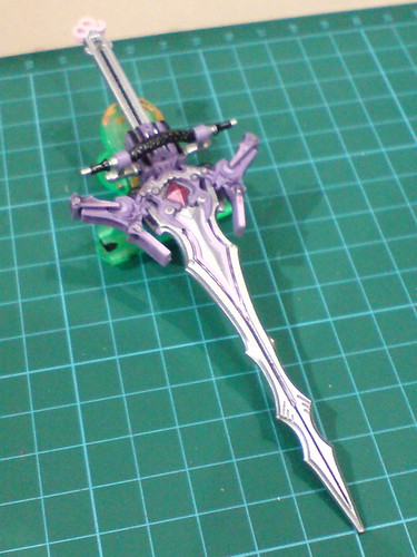
The bow-sword in sword mode.
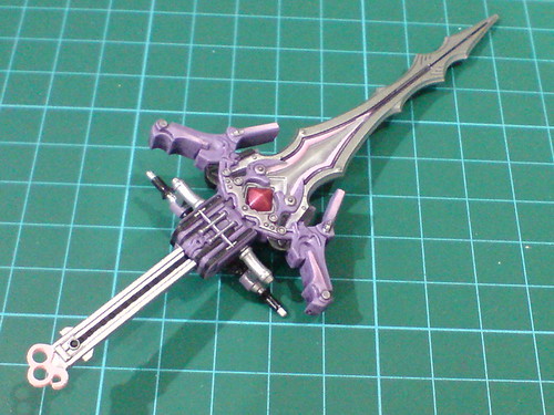
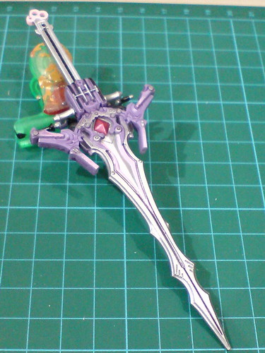
While it's supposedly the secondary mode of Serah's designated weapon, I find myself liking the sword mode a lot more than its bow mode. ^^;
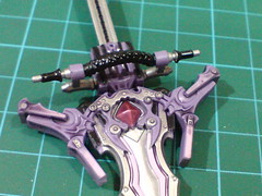
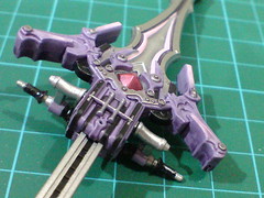
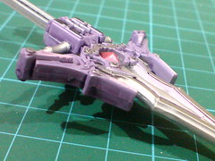
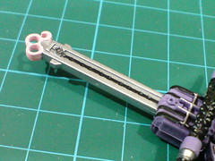
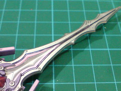
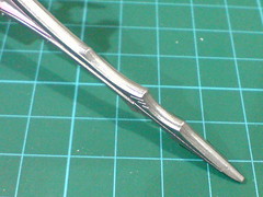
Closeups on the details of the sword.
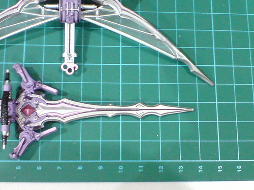
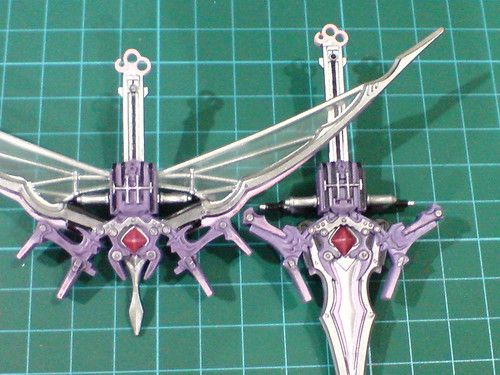
Length comparison between the two weapon modes.
The sword is just 1cm shorter than the overall bowspan.
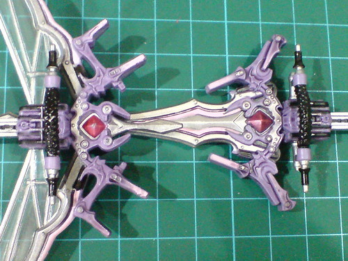

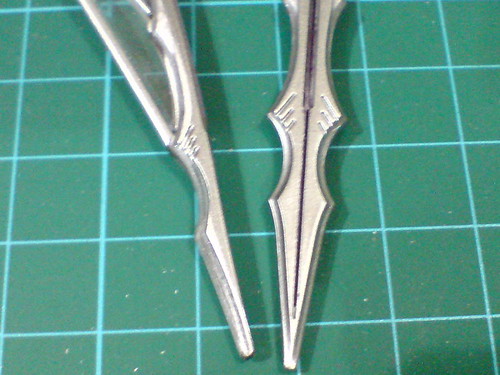
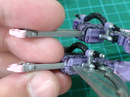
Comparison between the weapons' details in different modes. ^^

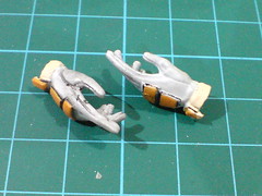
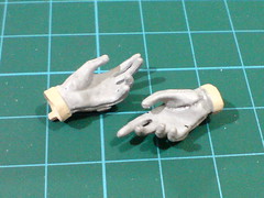

Option hand units included for Serah: a pair of spread palms.
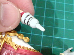
(Left) Pretty simple-looking hinge-swivel combinational joint for the wrist.
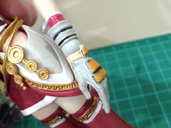
(Right) With the spread palm swapped onto the wrist.
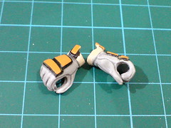
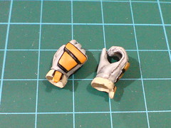
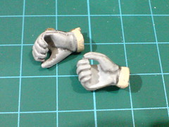
The default pair of open fists.
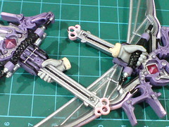
Unlike Lightning as shown in the previous posting, both of Serah's open fists can be used to hold the weapons.
More images of Play Arts Kai Serah Farron:
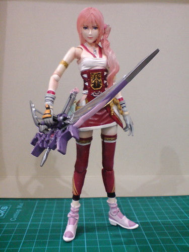
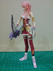
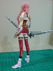
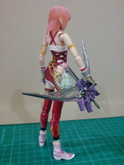
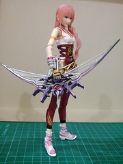
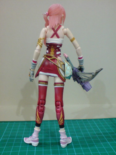
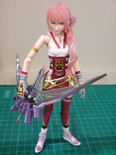
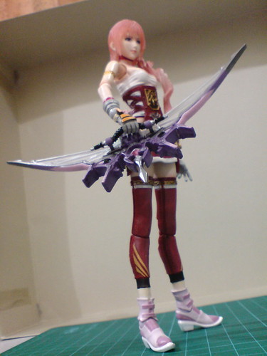
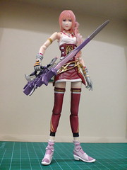

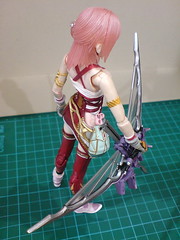

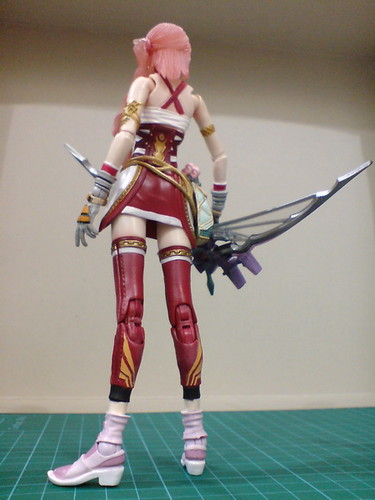
Closeups on the details:
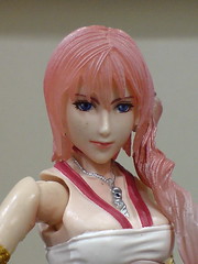
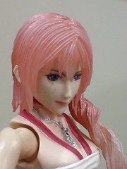
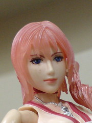
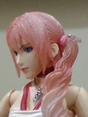
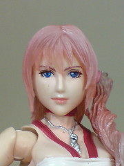


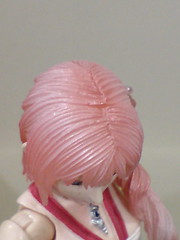
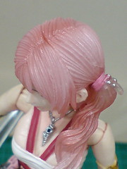


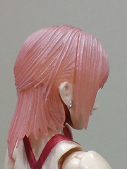
[Head]
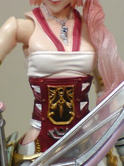
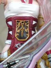
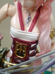

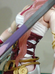
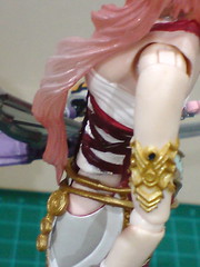

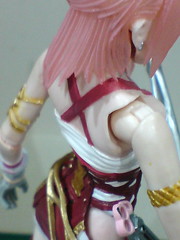
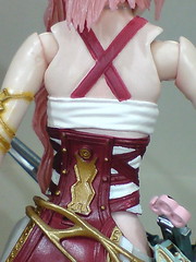
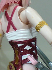
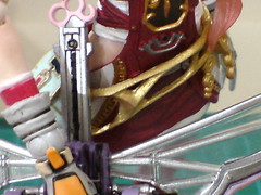
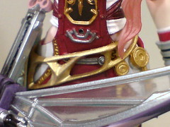
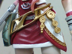
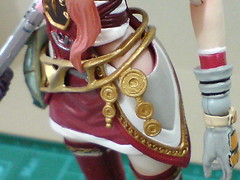
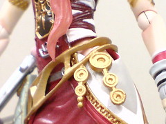

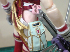
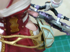
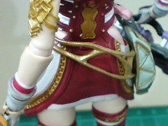
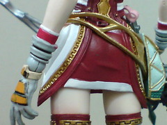
[Body]
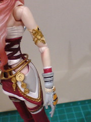
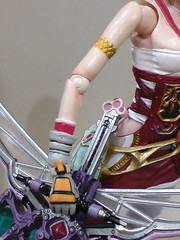
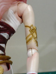

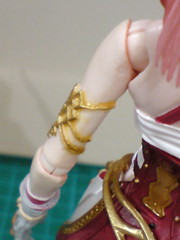




[Arms]

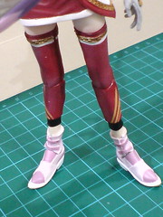
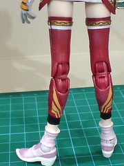
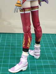
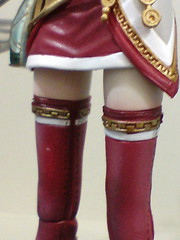
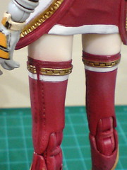
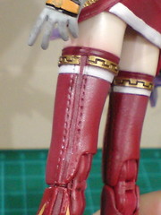

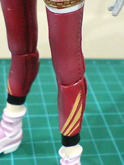
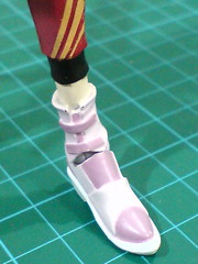
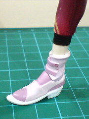
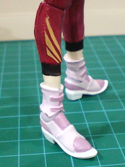
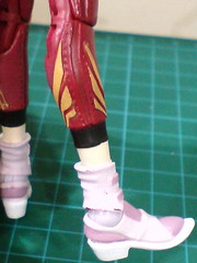
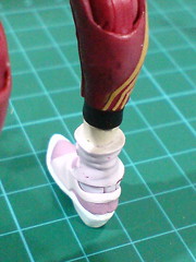
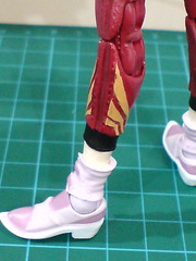
[Legs]
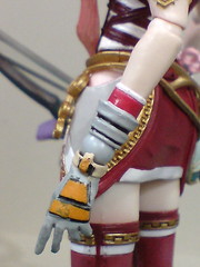
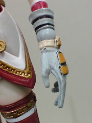
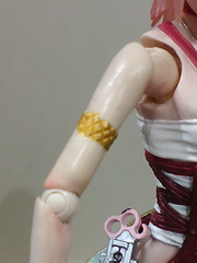
Another fantastic figure after Lightning in terms of sculpt work and paint details. ^^ Despite not having a suit of body armor, there are plenty of very beautiful details to be seen on this figure. Much like her sister, the head sculpt of Serah is fantastically executed, and with the extra pigtail on the left side of her head, there are arguably more sculpt details to be observed on Serah as compared to Lightning as well. ^^ Larger-sized components like her dress (if you can call it a dress ^^), belt and pouch, leggings, boots, and weapons have very obvious details to be seen, and all of them are very nicely sculpted and painted. ^^ However, I feel that with Serah, some of her smaller-sized accessories realized on the figure, including the jewelries on her hair tie, earrings, necklace, armbands, coin-like attachments hanging from the belt, and minor details here and there are more outstanding in appearance. You don't find a lot of those on Lightning. ^^ She is evidently shorter, and smaller in volume when compared to Lightning because of character and costume design, but that doesn't mean she's less detailed than her sister. In fact, in terms of quantity of details, I think it's the other way instead. ^^ For that, Serah's certainly a more colorful figure (literally ^^) as compared to Lightning, which helps to reinforce the character differences between the two sisters.
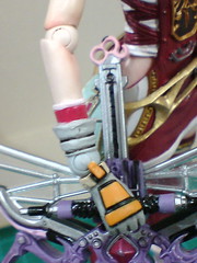
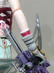
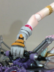
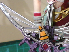
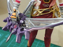
One particular point I don't really like about her design is the pouch's position. The pouch itself is very beautiful. ^^ Its shape and golden line details make it seems believable as a pouch, even though it's fixed part attached to the belt. Then again, as the pouch is positioned on her right hip, and the figure is holding the bow-sword on her right side at the same time, the two components unavoidably collide with one another. With the bow-sword being such a huge weapon, it's hard to adjust it to sit properly on the right hand side of the figure with the pouch in its way. ^^; This is the moment when I hope that the belt isn't fixed to the left hip so that it would be possible to shift it to the back, along with the pouch obviously. I suppose that option was not considered when the figure was designed in order to preserve the accuracy of the figure's look to her character's appearance in the game. From the images above, you can see that the weapon, along with Serah's right arm that is holding it are seemingly "pushed" to the front because of the aforementioned collision. ^^; The look actually brings up another visual flaw about the figure, one that is unavoidable, unfortunately. ^^;
As Serah's costume is more exposing than Lightning's, which in itself isn't a bad thing, XD some of the joints on the figures are too obviously exposed. ^^; The look of the shoulder joints is particularly bad. ^^; The difficulty in adjusting the right arm because of the collision between the bow-sword and the pouch adds insult to injury in that sense, as it makes the right shoulder even more exposed than ever. ^^; As mentioned earlier on, there are many details on the figure that look great on closer inspection, but the huge gap between the shoulders and upper arms is hard to ignore even if the figure is viewed from afar. ^^; It's the same issue as Cammy actually, and just like her, the overly exposed look of the joints is a matter of character/costume design instead of the figure's own fault. The look may be annoying, but unavoidable as mentioned earlier on. ^^; On the other hand, Lightning is somewhat fortunate to have layers of shoulder plates to somewhat cover up the gap between her shoulders and the upper arms. The split is still visible in front of the figure, but it's not as obvious (and as ugly) as that on Serah.
Going back to Lightning next to have a look at the figure's articulation design and posability. ^^


No comments:
Post a Comment