More images of the just completed MG Zeta Gundam Ver. 2.0. ^^

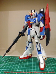
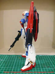
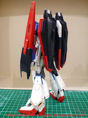
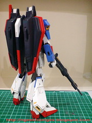
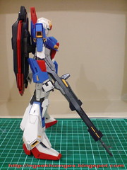
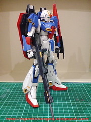
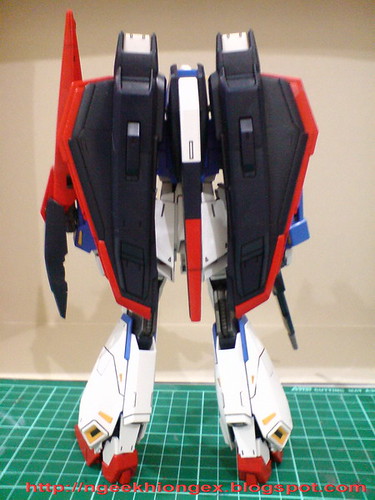
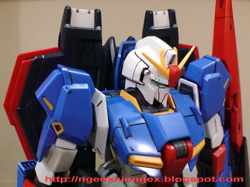
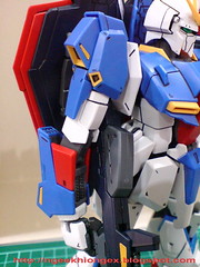
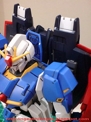
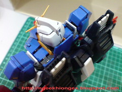
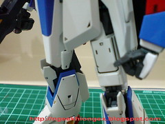
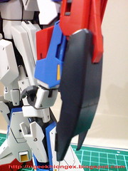
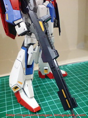

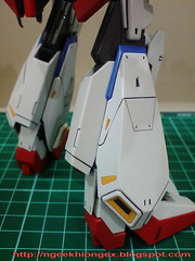
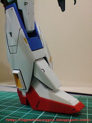
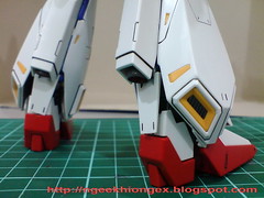
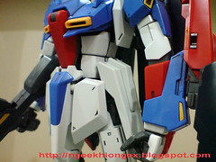
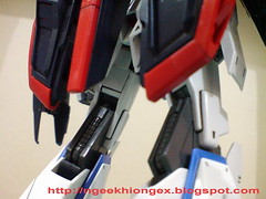

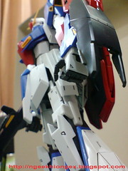
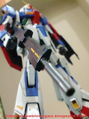
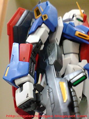
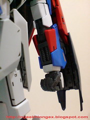
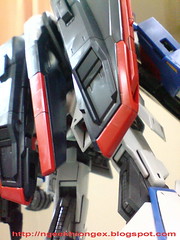

Very slim, very cool, definitely the best looking design of Zeta Gundam so far. Edges of the shoulder armors, arms, waist armors, shield and legs have been refined to look much sharper (literally) than all the previous versions. This can be seen especially on the design of the red parts near the elbow, the shield and the waist armors. Paired it with MG Ver. 1.0 and the differences would be very easy to see.
Action poses in the next review. ^^


2 comments:
OmG! Drools~~ I would really want to get this kit someday. Btw, I heard that this kit is back heavy. How did you manage to balance it??
A flawless job :)Looks great .Does this kit suffer from loose parts or joints due to the transformation feature?
Post a Comment