A look at Figma Kamen Rider Axe's articulation design after the previous posting. ^^
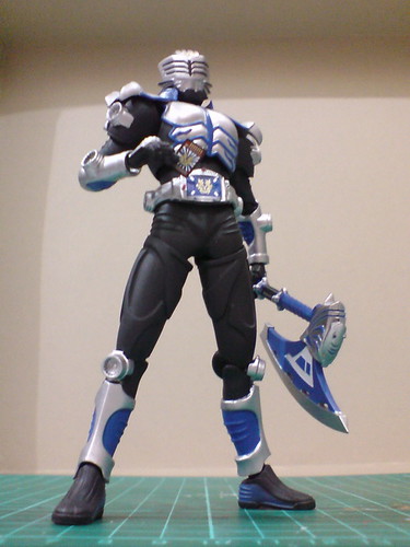

Essentially, the articulation design is exactly the same as that of Kamen Rider Thrust. I suppose since all the Kamen Riders' designs are just about the same in "Kamen Rider: Dragon Knight", the same formula in terms of articulation design can be repeated for everyone. ^^

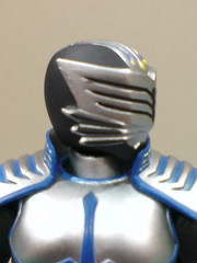
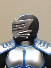
Horizontal tilt is not a problem at all for the head.
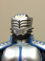

Tilting the head upward is a bit troublesome because of the neck joint's design, but that movement can be vaguely seen nonetheless.


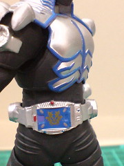
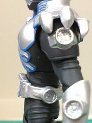
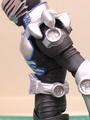

Side-to-side and forward-backward bends are possible for the waist.
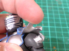
While the shoulder plates are fixed to the body armor, they are made of soft plastic that allow them to be bent very easily.
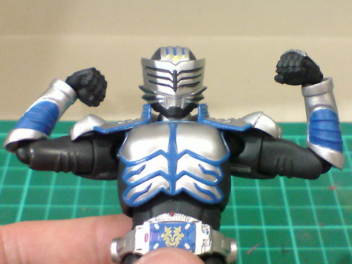
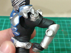
Standard articulation for the shoulders and arms.
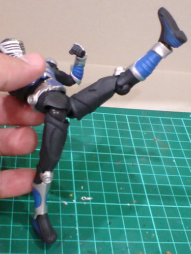
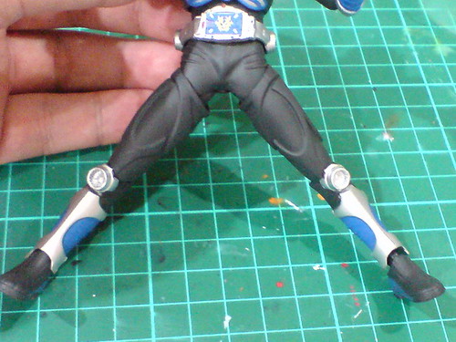
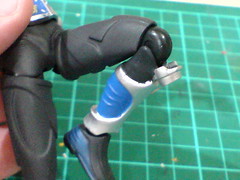
Standard articulation range for the legs as well I would say.
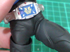
Just like the same part on Kamen Rider Thrust, the layer of soft plastic on the hip hides the ball-type joints and give the thighs' movement a more realistic and human-like appearance. ^^


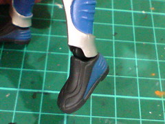
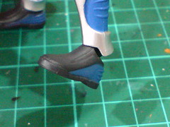
Standard articulation range for the ankle joint.
Some action poses of Figma Kamen Rider Axe after the introduction on its articulation design:
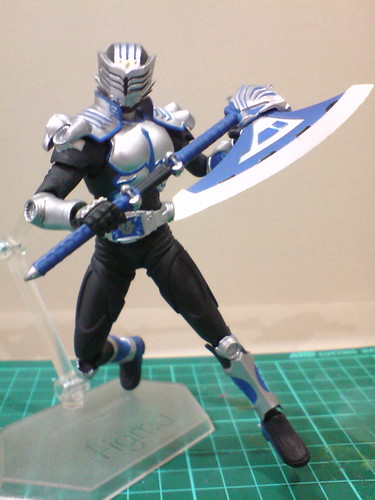
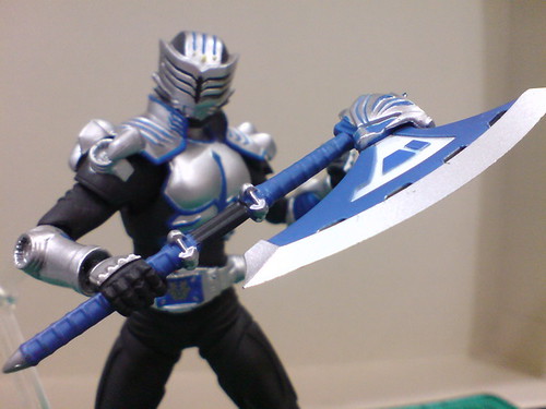
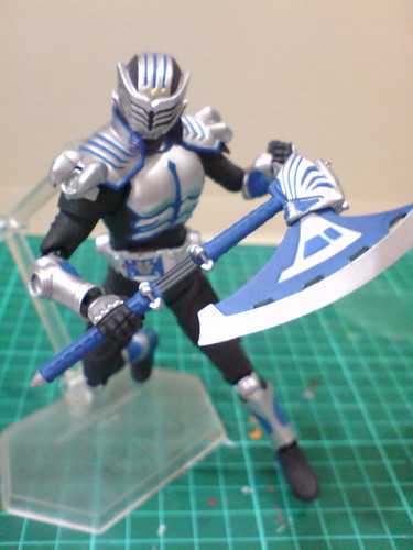
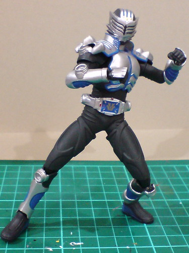
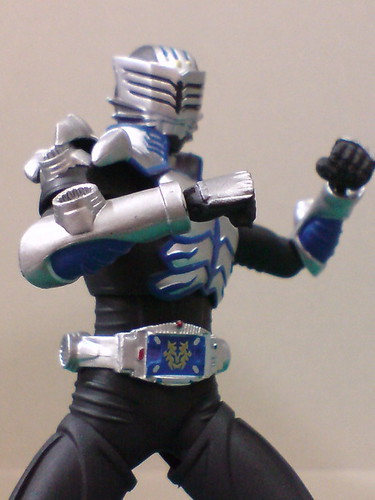
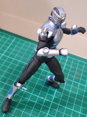

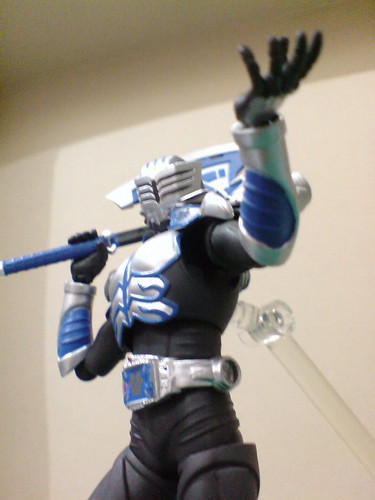
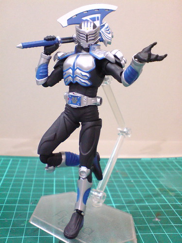

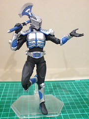
More action poses from this action figure, including those that feature his Strike Vent weapon coming up in the next posting, which will be the last one for this review series. ^^


No comments:
Post a Comment