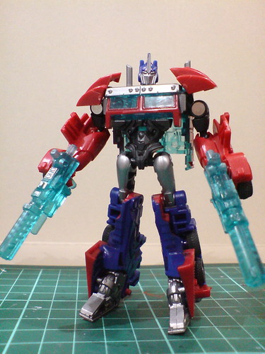
More images of "Transformers Prime" Cyberverse Commander Class Optimus Prime in robot mode after the introduction in the previous posting. ^^
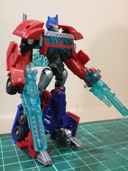

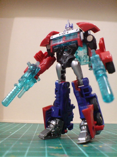
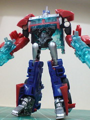
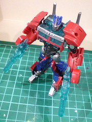

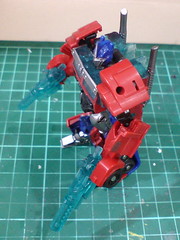
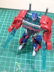
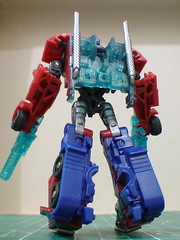

Closeups on the details:

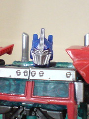

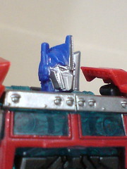
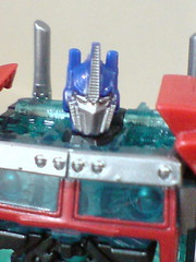


[Head]
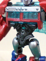
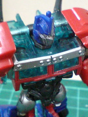

[Body]
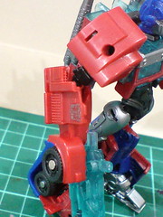

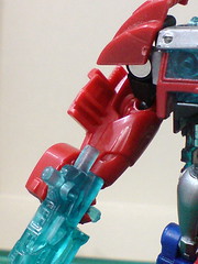
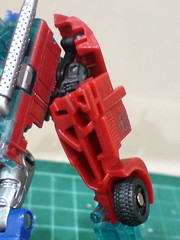
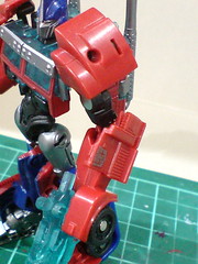
[Arms]


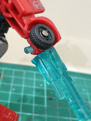
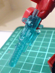
[Blasters]
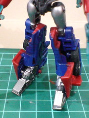
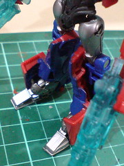
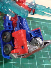
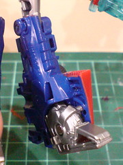
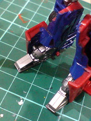
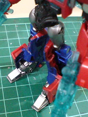
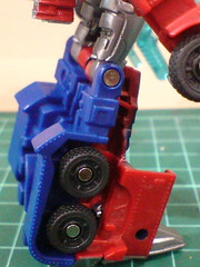

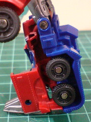
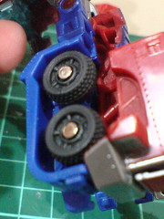
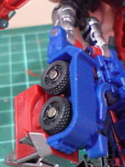
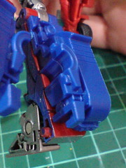
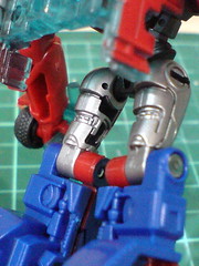
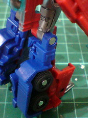
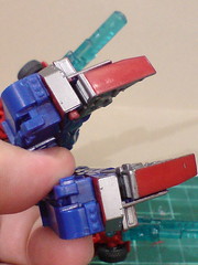
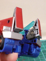
[Legs]
For a Cyberverse figure, most of Optimus Prime's details are pleasantly well done, and are quite accurate to his TV design. ^^ The abdomen, waist and thighs have the right American-superhero-like proportion (XD) that is pretty close to his "First Edition" Voyager Class self. The head sculpt is absolutely fantastic in my opinion. ^^ Despite it's missing quite a few colors as compared to the "First Edition" Voyager Class equivalence, tiny details which are made even tinier because of the product series, like the line details of the horn, sideburns and most important, the eyes can be seen very clearly. The entire head is very well proportioned to the rest of the body as well. ^^
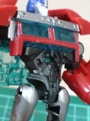
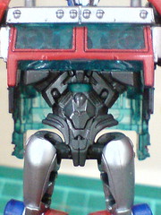
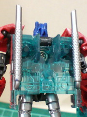
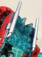
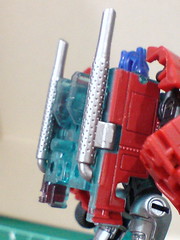
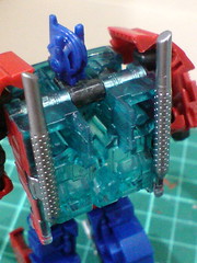
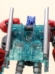
For the entire figure in either vehicle or robot mode, only the windshield needs clear teal as its color, but that's also the color for the shoulder area and its back. Looking at the transformation design, it's clear to me that having so much clear teal part on the figure is really just because the main body segment is made from two single-piece parts, and they were molded in clear teal. ^^ The silver and red frame details around the windshield, as well as the cab side red paint were added onto the clear parts. Normally, I would say that this is a display of inadequate paint work and attention to details, but for this figure, I really like the look of the clear teal back, so I'm not going to complain about it at all. ^^
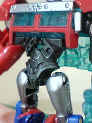
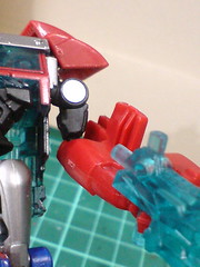
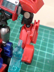
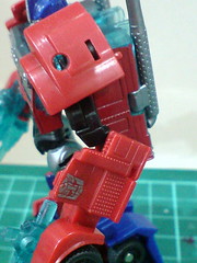
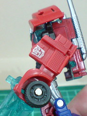
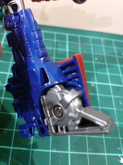
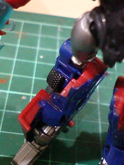
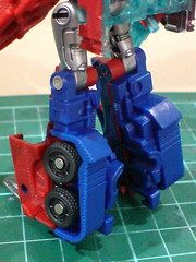
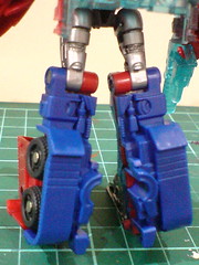
On the flip side, I think the robot mode's look does suffer from its size restriction. This is the biggest flaw of this figure in my opinion. There are too many appendages that are "just there" because of their transformation design (or lack thereof to be precise). Part of the truck nose that can't transform properly become large plates on the side of the ankle. Large chunks from the cab side, include the front wheels burdens the forearm - when I saw the figure the first time, the hands' small size and lack of paint work gave me the wrong impression that the wheels are going to be his hands. ^^; The same weakness can be said regarding the chest as well. Since there's no transformation gimmick for the windshield, when the chest is formed, it looks flat and kind-of dull. ^^; A broad and muscular-looking chest is one of Optimus Prime's signature design traits in my opinion. ^^ So not having that feature on this figure takes away part of the boss's fierce look for me. ^^;
Then again, I don't it's fair to ask for everything to be perfect for a Cyberverse figure. Between the two modes for Optimus Prime, I believe he looks better in his vehicle mode. The robot mode has a few merits in display and details, but its real strengths are the articulation design and weapon storage options. All that to be shown in a separate posting. ^^
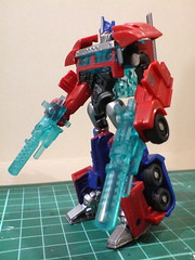
Another problem I have with Optimus Prime, which is rather weird but unpleasant nonetheless, is the difficulty of adjusting a proper standing pose for him. ^^;
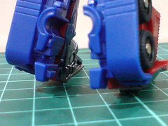
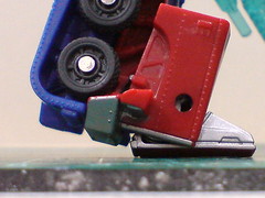
In the images above, the legs are not straightened actually. As you can see, there's a bit of space between the heel and the surface Optimus Prime is standing on. ^^;
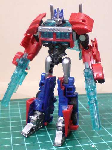
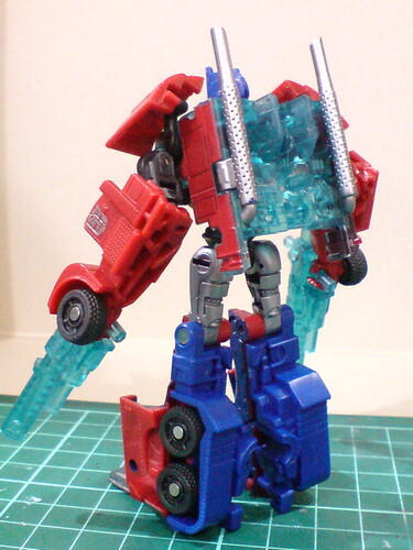
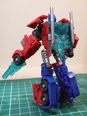
If the legs are straightened, with the feet folded completely so that they touches the surface without any gap, the upper body would have to be adjusted to lean forward a little bit.

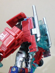
The forward lean is very obvious when you observe the back (see the smoke stakes) from the side. ^^;
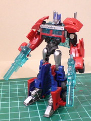

Without the slight forward tilt, the "absolute" straight standing pose of Optimus Prime is unbelievably boring-looking. ^^;
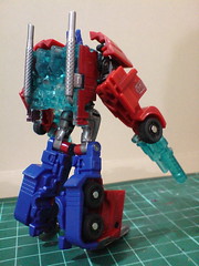
The large feet from its transformation design gives the figure a rather imbalance proportion when viewed from the side. ^^;
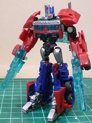
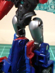
A way to get around the disproportionate look shown above is to do an "inverted" bend to the knee. This will send the legs backward a little bit to offset the protruding feet in front of the figure.
Then again, the look of the knees is very unnatural. ^^;
There are options in adjusting the legs, but I've yet to find one that can truly give the figure a good-looking standing pose. ^^;
Moving on to the transformation sequence and images of the vehicle mode next. ^^


No comments:
Post a Comment