More images of Robot Damashii Doraemon after the previous posting. ^^
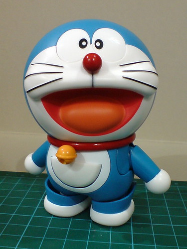
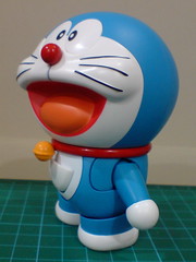
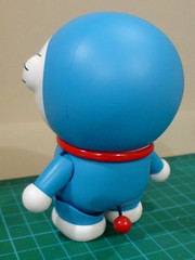
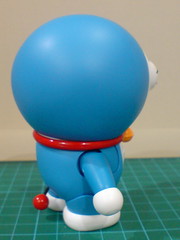
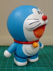
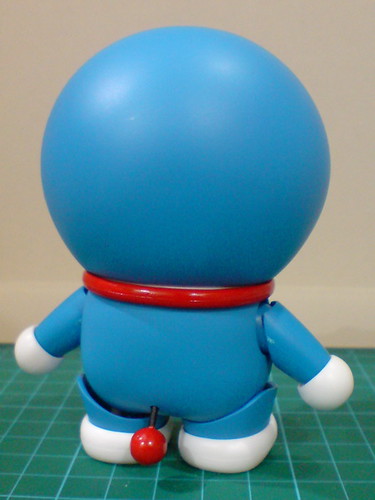
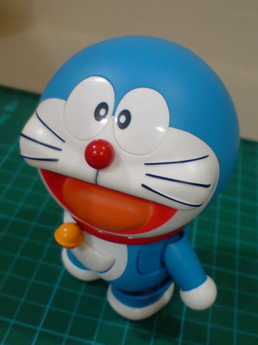
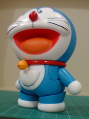
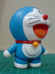
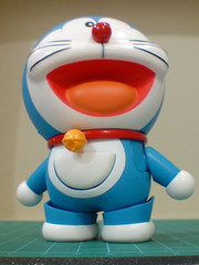

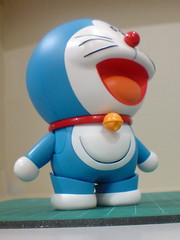
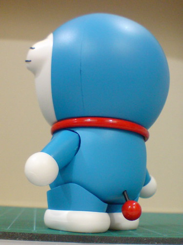
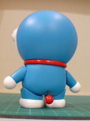
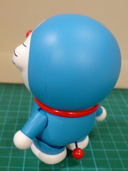
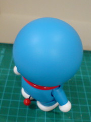
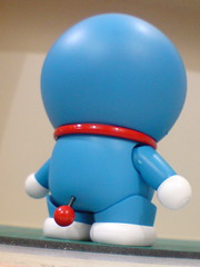
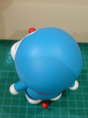
Closeups on the details:




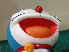
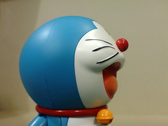


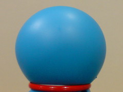
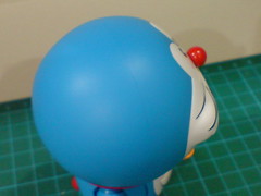
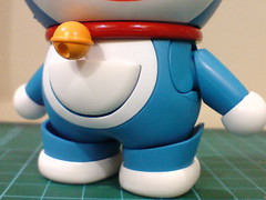
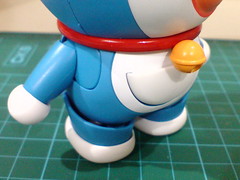
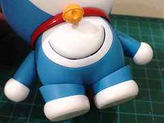
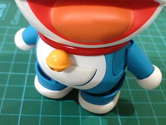
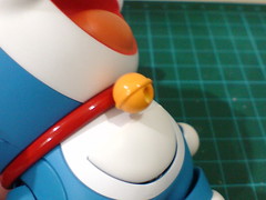
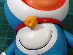
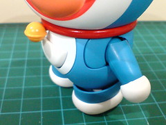
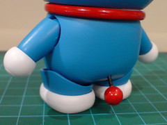
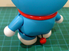
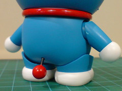
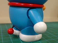
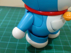
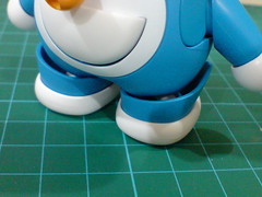
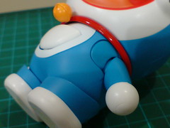
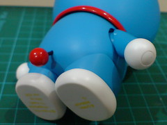
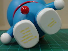
I mentioned about the challenges of realizing Doraemon into an action figure back in Part 1, where balancing between anime accuracy and articulation is a huge issue for the character. Not surprisingly (to me), that issue can be detected very easily even before looking at its posability. ^^; As its head is a huge round ball, Doraemon's eyes "disappear" very quickly when the figure is viewed from a low angle, however slight that angle may be. ^^; The very obvious cut on the shoulder areas and legs for articulation purpose can be quite an eyesore as well. This is especially true for the legs. The space between the thigh and hip is pretty much impossible to conceal. I found out about that after trying very hard to squeeze the legs together for the gap to be hidden, but to no avail at all. ^^;
As mentioned before, allowance must be made since the figure is meant to be movable and posable. How much compromise to either the overall look or the articulation features for the benefit of the opposite factor to be counted as acceptable is highly debatable. I realize the issues with Doraemon's design for an action figure release before getting this Robot Damashii set, so the overall look doesn't irk me too much that I would consider it a failure. ^^; There are definitely good design features to be seen on this Robot Damashii figure, the smooth look of the head and excellent paint work for some of the parts for example. ^^ As shown in the previous posting, magnets are used to connect option parts to the Doraemon's head. With a head that big, it would be so much easier to have pegs and slots on the components, which would be a standard design feature for Robot Damashii releases anyway. Instead, magnets are used to give the head a better and more complete look. As a result of that, the head is extremely smooth. ^^ The eyes' position on the face may be somewhat annoying as highlighted earlier on, but the entire head, which forms almost half of the figure's height by the way is very well designed. ^^
Doraemon himself has a very simple blue-white-red color scheme, but some of its option parts are a lot more colorful. As shown in the previous posting, parts like Small Light and the Dorayaki very beautifully painted. With the wide smile-type option face part swapped onto the figure for the images above, the really nice paint result of the mount area can be seen very clearly. ^^ The really smooth edge between the white and red areas is pretty amazing in my opinion. ^^ Then again, while the paint work is awesome, the sculpt work of the mouth area hits one of the "weird" design considerations for Doraemon as a 3D figure. With a head that big and a body that small, why is the opened mouth just a sunken area on the face? Shouldn't the wide opening of mouth let you peek right into the body through its throat? ^^; Gosh, that's a scene that could give fans of Doraemon "childhood's over"-theme nightmares I guess. XD The design of having a red mouth area and orange tongue on this option part, as well as another similar part shown in the previous posting is aceptable I suppose, but the look is very weird from various angles. ^^;
Examining the articulation design of this action figure:


360-degree swivel for the head.
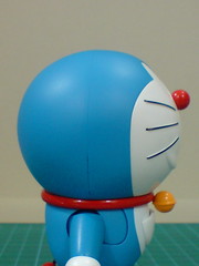
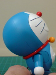
The head, along with the bell strap can be tilted backward for a wide degree. It's not possible for the opposite action though. ^^;
As shown in the previous posting, this articulation point is crucial for the Dokodemo door pose.
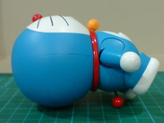
Due to the imbalance weight distribution on the figure when the head is tilted all the way to the back, Doraemon will topple in the same direction, unfortunately.
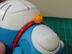
The edge of the white chest and belly "patch" that is hidden in normal view. ^^
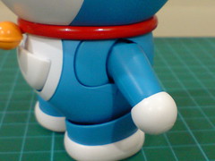
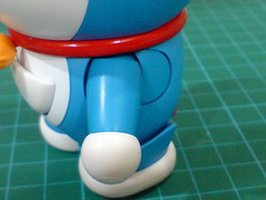
Slide gimmick for the arms. There are a pair of plate in front and behind the shoulder joints. As the arm is slide to the back (left image), the rear plate pops under the body, while the front plate pops up to fill in the gap in front of the shoulder. ^^ The opposite happens when the arm is slide forward. ^^
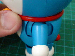
A clearer view of the two plates: with the arm positioned right down the middle on the side of the body, neither plate can pop up/under, resulting in obvious the gap in front and behind the arms. ^^
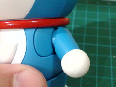
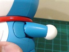
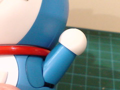
Swivel action for the shoulder.
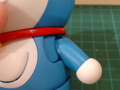
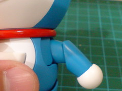
Another interesting articulation feature for the arms: the shoulder can be extended horizontally, giving the arms extra room to maneuver on the side of the body. ^^
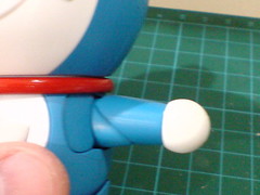
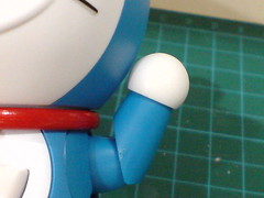
With the shoulder expanded, the arm can be raised and straightened on the side of the body (left image).
An "elbow joint" is created through the shoulder expansion as well. XD
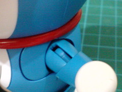
Closeup on the hinge joint inside the shoulder.
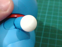
Doraemon's hand is actually on a ball-type and swivel wrist joint, but given its inability to hold anything other than the option parts included, the joints are not exactly useful I think. ^^;
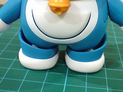
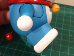
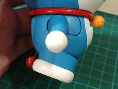
The legs can swing forward/backward.
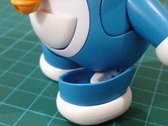
The huge gap between the leg and its joint inside allows the former to "step" forward. ^^
It sounds interesting, but the gap is not exactly great to look at. ^^
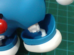
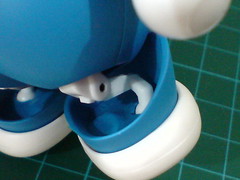
Closeup on the super thin hinge and ball-type joint of the leg.
The hinge segment remains retracted inside the figure's body until it's needed for the wide forward/backward swing shown earlier on.
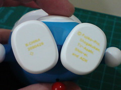
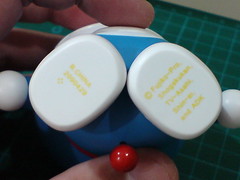
Using the ball joints, the feet can swivel around on the leg joints.
Since they are fixed, the legs move together with the feet. ^^
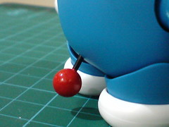
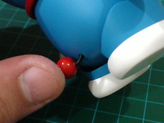
Doraemon's balloon tail (its power switch ^^) is made of soft plastic and can be bent very easily.
The multi-joint design of the shoulders, including the expansion gimmick are very interesting, and very practical at the same time. With a huge round body in the way, there's very little the arms can do unless some special joints are incorporated. XD
All action poses featuring Doraemon coming up next. ^^


No comments:
Post a Comment